2011 haiti_utk publication

One to Another

A Downloadable Publication from the 2011 Haiti UTK Studio


WBIR Report of the Haiti Studio

Introduction haiti_utk

Welcome to the Haiti UTK site! The work on these pages reflects student engagement in design for both a school and housing for the community of Fonds des Bloncs, Haiti in collaboration with the Haiti Christian Development Fund. The project was initiated in the early fall of 2010 and subsequently a class of 19 students, in the spring of 2011, was given the responsibility of deisgning a secondary school. The school is under constuction. A new group of students is now hard at work developing new housing in Fonds des Blancs. The work of these students can be seen in the pages of this blog. Students of the class will be traveling to Haiti Februay 2-6 to collect addiional data. It is anticipated that this second phase of the project will be completed in late April with construction starting summer 2012. The work of the students is being guided by three primary faculty, John McRae, David Matthews, and Chris King, a local practictioner. The students during their exploration will engage a wide range of issues including context, culture, resources, climate and other outside factors not common to their expereince. 

Students: Cassidy Barnett, Aaron Brown, Sarah Heimermann, Mitzi Coker, Emily Corgan, Ben Cross, Peter Duke, Emily Fike, Sam Funari, Lauren Heile, Kendra McHaney, Lauren Metts, Morgan Oiler, Bernice Paez, Forrest Reynolds, Emily Ryan, James Sawyer, Zachary Smith, Robert Thew, Cory Wikerson Faculty: John McRae, Chris King, David Matthews

search haiti_utk
Special Thanks!

The Haiti Studio for spring 2012 is being supported by HaitiServe foundation based in Knoxville Tennessee, that is focused on outreach and engagement in improving conditions in Haiti. 

Entries in Clinic (9)

Monday
May062013

Clinic Community

FUNCTION

Clinic Community strives to provide a variety of services to the citizens of Fort Liberté. In addition to serving as an innovative local clinic, the complex also provides educational services as well as opportunities for community involvement.

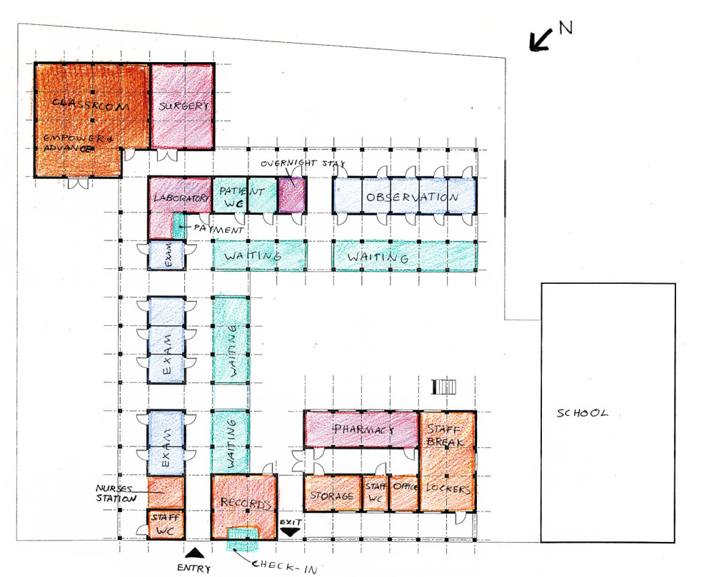
The clinical component is composed of standard medical program such as triage, exam rooms, observation rooms, laboratory, and pharmacy. The clinic provides anywhere from basic medical services to eye and dental care. In the proposed third phase of the project, a medical suite is included in order to fully encompass the needs of the local population. The waiting area of this component takes place in a designed intermediate space for comfort and ventilation. It is also articulated with a strategic color system in order to provide way-finding.

PREPARING FOR RAIN

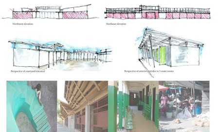
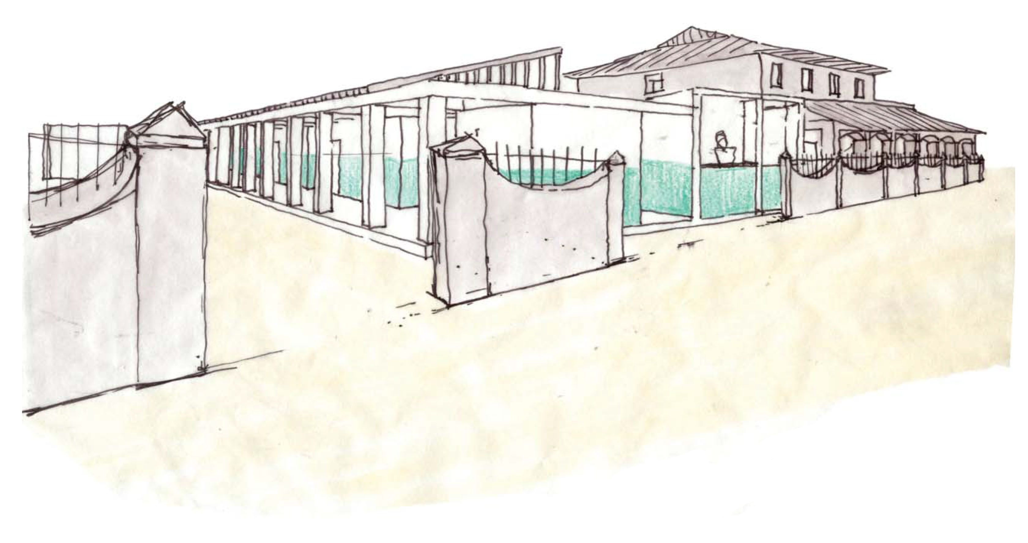
When it rains, it pores in Haiti. So its important to keep rain from blowing into the building. woven palm wscreens used as windows and doors allow air to flow while keeping the rain out.

FORM

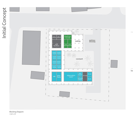
The plan of the complex is organized in a way that allows for both easy way-finding as a visitor of the clinic and also provides a sense of community. It achieves these things through the use of a courtyard scheme. The primary programmatic components of the structure are organized around a central courtyard that provides not only a large community space, but also allows adequate ventilation throughout the complex.

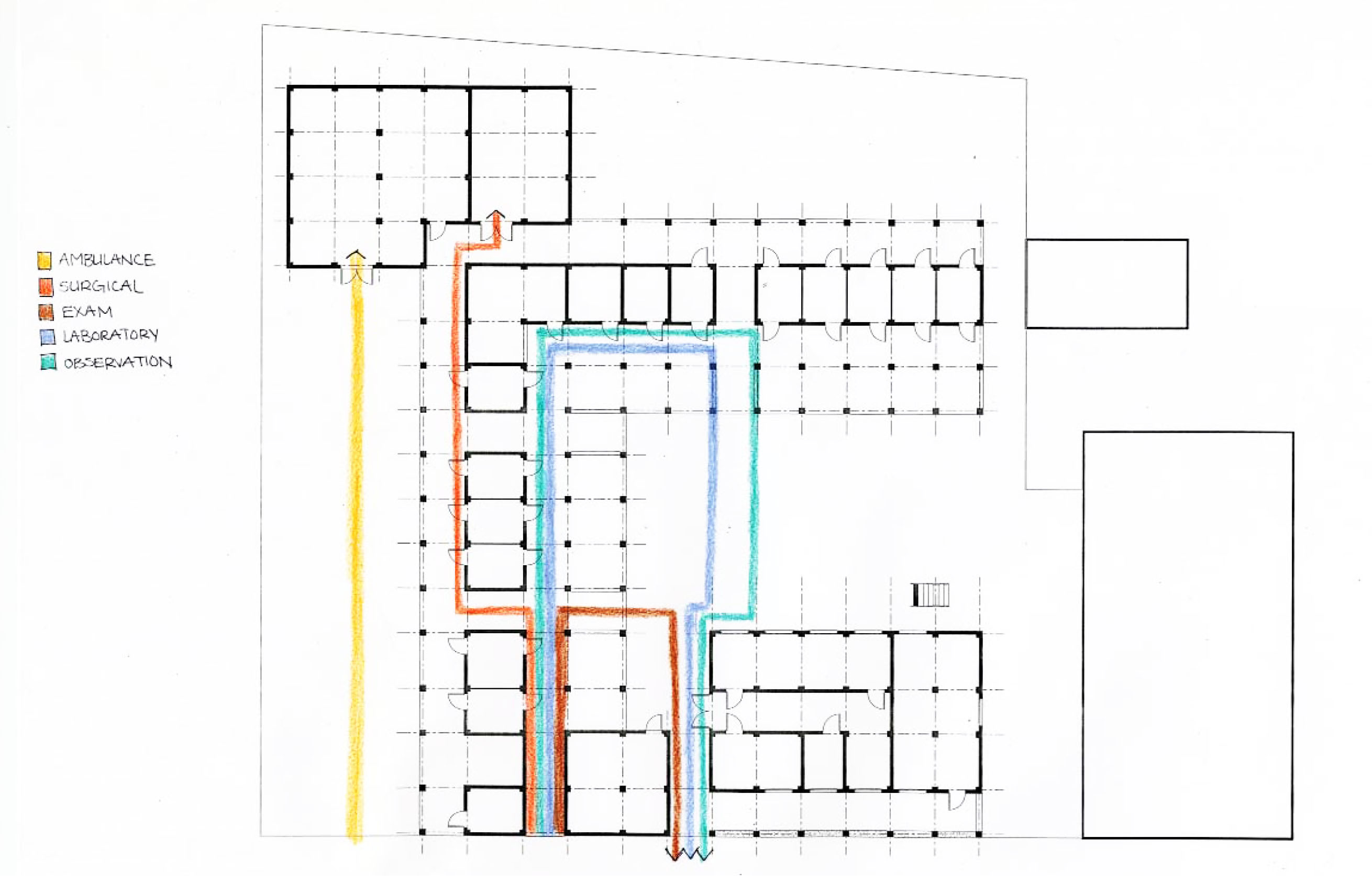
The courtyard is divided by a series of stepped concrete walkways. The steps of these pathways allow for additional seating and the pathways are placed in a way that relates exam rooms to the observation room, laboratory, and pharmacy. The pharmacy is located upon exit of the complex and can also be easily accessed from the street.

MADE IN HAITI

Another underlying concept of the Clinic Community is the commission of local artisans and craftsmen to create a comforting and recognizable environment for its visitors. These commissions would take form in everything from furniture and millwork to seasonal murals and wind chimes.

SEATING

The seating is made from painted #5 rebar and sealed palm wood and would be made by local craftsmen. Since much of the seating is in a semi-enclosed area slats afford a surface that would allow rain to run off.

Final Boards

Saturday
Mar092013

Expansion to Eben-Ezer Clinic

Concept diagram and abstract


After further investigation, I have decided to adjust my two entries by emphasize a primary entryway in my site plan for the new court-yard clinic and visually shrinking the secondary entrance between the technical school and the original clinic structure. To accomplish this, I am adding more green space to scale down and narrow the secondary entrance. The design modification will create a defined, main entry and a separate green space for the classroom.


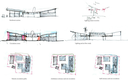
I am happy with my roof pitch, covered waiting area, and circulation.  The awing serves as a light shelf to reflect light into the interior spaces and also provides shade for circulation and patient waiting area.  The interior exam rooms have been arranged to take advantage of the light shelf and organized to eliminate glare.  The two separated roof pitches allow air to circulate through the spaces.


Saturday
Mar092013

Fort Liberte Medical Clinic - Erin + Emmie

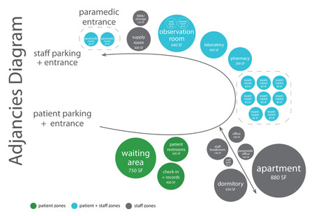
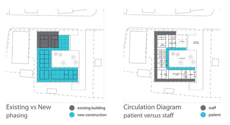
Our goal for the addition of the existing medical clinic is to provide a larger facility that blends in with the Haitian surroundings, as well as make the patients and staff feel as comfortable as possible. We intend to implement this by utilizing passive ventilation and natural lighting as much as possible, and to thoughtfully consider the materials used throughout the project. Another important element is clear flow of circulation between the patients, the patient and staff members, and the staff alone.

The design was modified to include all of these aspects, as well as considering the sustainability of the building in regards to materials and the durability. We also considered the phasing of the project to help with the ease of construction.

After talking with several professionals and the nursing students at the Foundry event, suggestions, critiques, and praise were given about the current direction of our project. The idea of the clear circulation and the division between patient and staff areas was a positive aspect. As well as a central courtyard is important for the passive ventilation in addition to the calming effect.

Our next steps will be to consider all of the feedback given from the different professionals and nursing students. We will consider the circulation and placement of each program element. In addition the layout of the design, the exterior façade will be a major consideration to assist in directions and clarity. Another important element that will be addressed is the courtyard and how that helps with certain aspects of the circulation, aesthetics, and ventilation.

Friday
Mar082013

Clinic at Fort Liberte - Team Sawyer, Sherborne, & Wetherington

Complete Project Page 1

Complete Project Page 2


 Much of Haiti's population cant read. Many have never been to a hospital. The medical need is so great that people will wait all day at a health care provider for the possibility of receiving care.

Our goal is to create a clinic that takes into consideration the patient experience and projects an image of professionalism, order and safety for its visitors.

As a patient, the first thing that you would receive upon checking into the facility is a card with a color on it. You would then be directed to go to the waiting room with the color that correspond to your card. The purpose of this system is to avoid both crowding and  confusion in the clinic: reduce crowding by spreading out the waiting areas, and reduce confusion by enabling the doctors to find their patients in the correct room color.

The only section of the main building that is completely enclosed is the single stretch of room at the core. Circulation and waiting are covered porches that look out onto a central courtyard. this allows for potential overflow space, natural ventilation and shading. This will also make it simpler to vent the core rooms by using a perforated wall on the east and south sides while maintaining privacy with a clearstory section on the west and north sides that encourages airflow through the rooms.


Another Important consideration for the function of the space is the path of circulation - or paths as the case is here. The types and range of treatments needed for patients will vary and it is important for movement through the facility to remain comprehensive and as uniform as possible. As such, we have taken into careful consideration the positioning of the entry, exit and used spaces so that no matter what you come to the clinic for, your journey through it remains relatively the same.


Sunday
Feb172013

detachApack: A Versatile Medical Clinic System


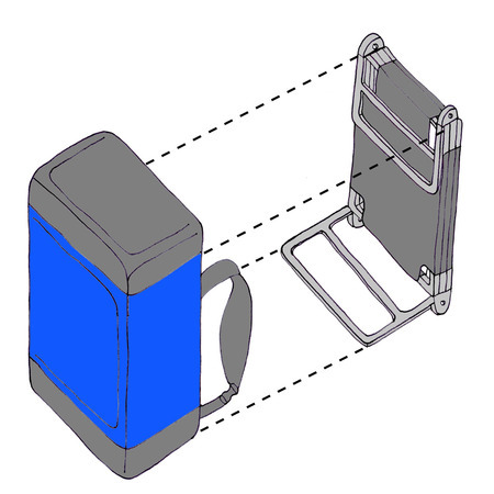
Duffel Bag and Frame/Lounge components of detachApack

DetachApack is a system designed to allow medical personnel to reach their set destination whether it be across difficult terrain, deep rivers, or other obstacles. These packs allow clinics to set up at the furthest of villages even when trucks cannot drive there. If the backpacks are stored on the trucks, then at any point when driving becomes too difficult, each team member can grab a backpack and they can finish the remainder of the distance on foot.

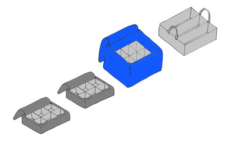
Zip-off detachable ends and compartments for organization of supplies

Each backpack consists of a pack frame and a duffel bag. The pack frame is multifunctional. Not only is it used to add comfort and help support the pack while hiking, but it also converts into a lounge for the patients to lie on while being examined, a chair for the medical staff, and even a stretcher in case of a critical needs patient. The duffel bag consists of three color coded pieces. The charcoal pieces on the end can be zipped off and used in the exam areas by the doctors and nurses. The blue center piece is then used in the pharmacy area. All pieces have organizational dividers so that all supplies are kept in place throughout the hike and are easy to find once at the clinic destination.

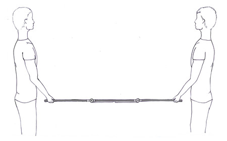
Frame/Lounge can also be used as a stretcher in the event of an emergency

The final review was a very helpful critique. We discussed the ways in which the packs could be filled with the exact same supplies or labeled when they differ. I think that it would be most beneficial if each backpack’s medical (charcoal-colored) bags were the same and each pack’s pharmaceutical (blue-colored) bag were different. Each packs medical compartments need to be the same so that each doctor and nurse can have every supply they need at hand and not go search around for supplies in others’ bags. Each pharmaceutical bag needs to be different, perhaps a different category of medication. Therefore when setting up the pharmacy area, the bags can be arranged in a helpful order by prescription type.

PDF of detachApack presentation