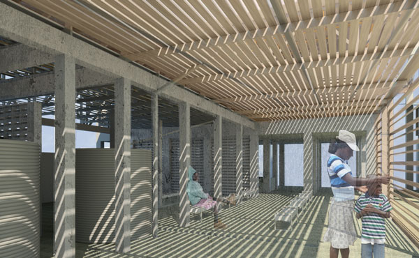
Eben-Ezer Medical Clinic, Ft. Liberte Haiti
 Monday, May 6, 2013 at 12:39PM
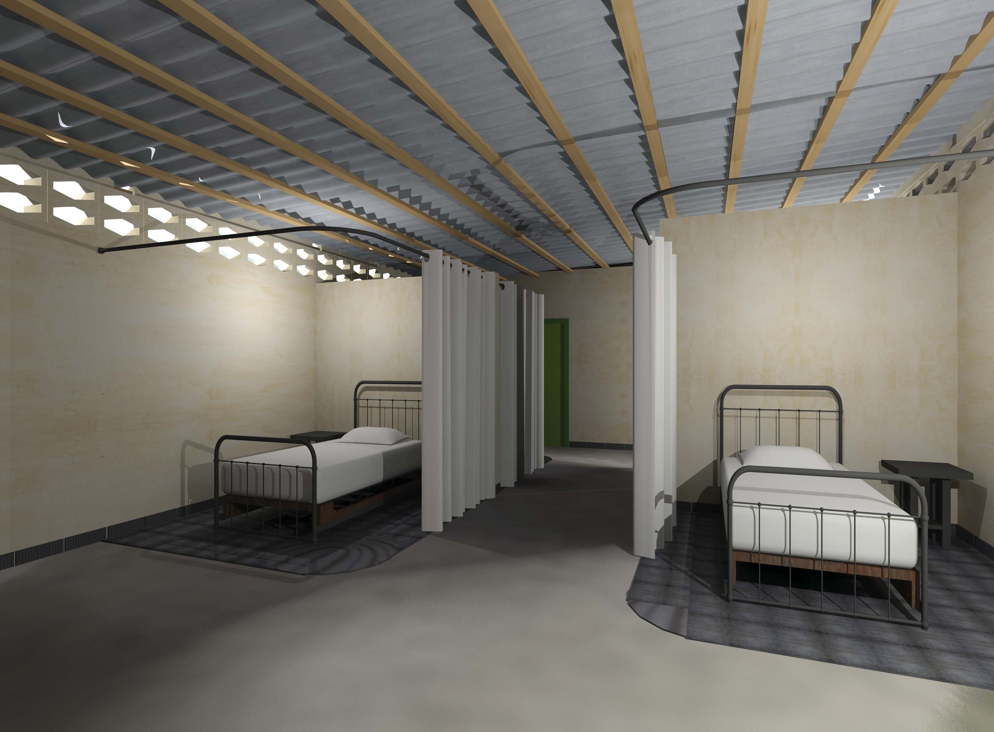
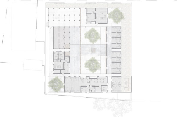
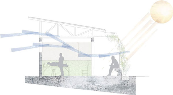
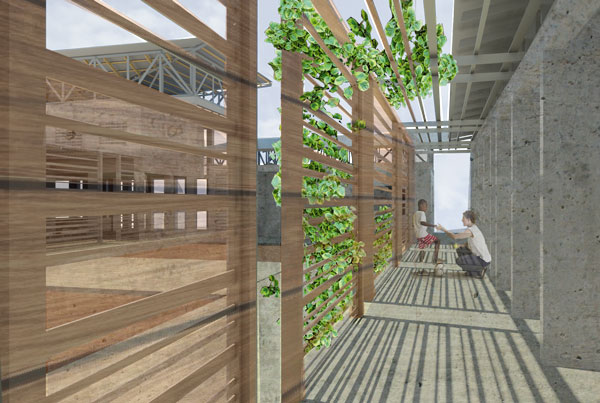
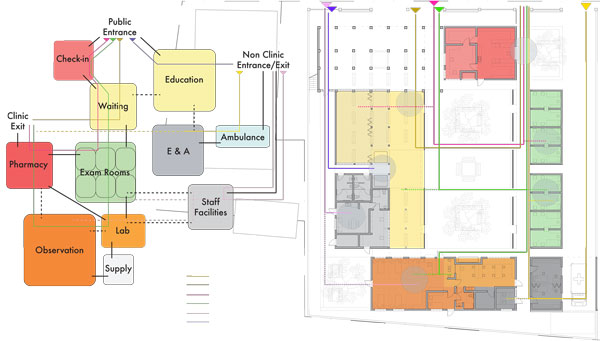
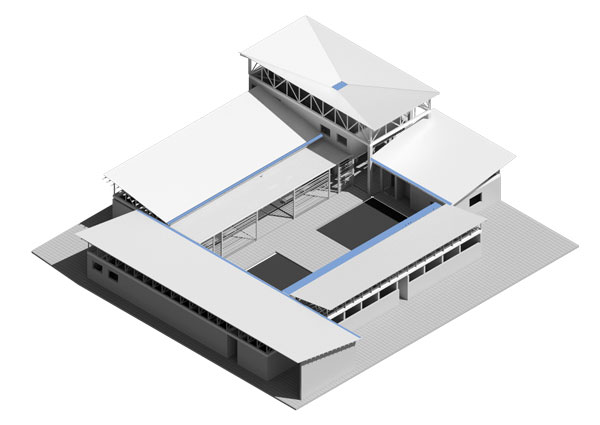
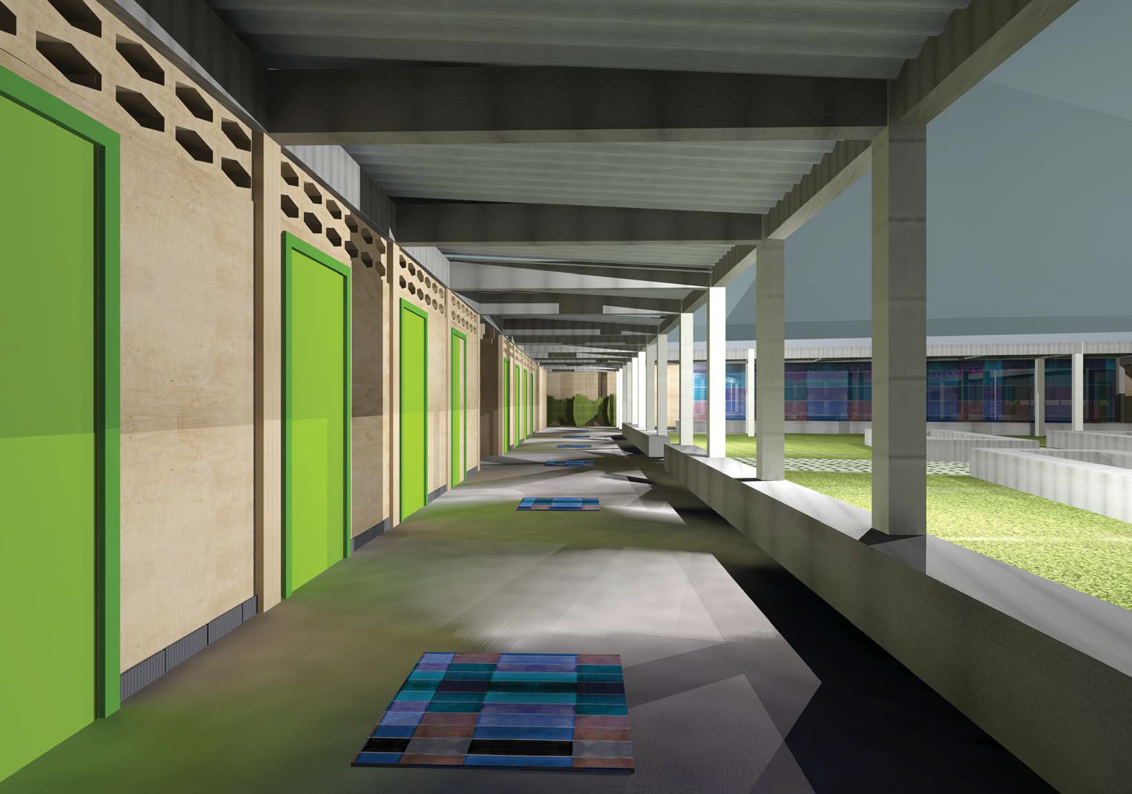
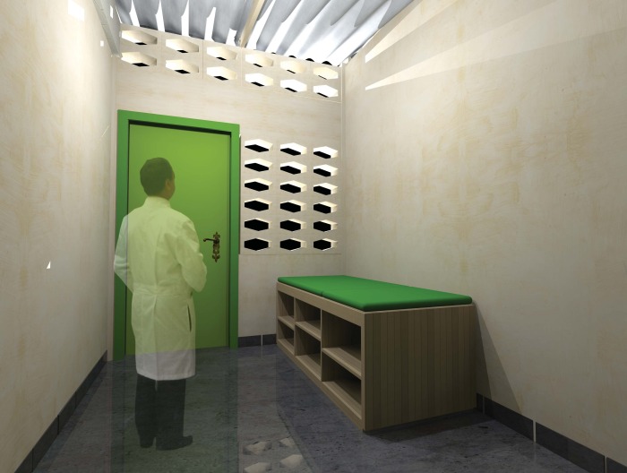
 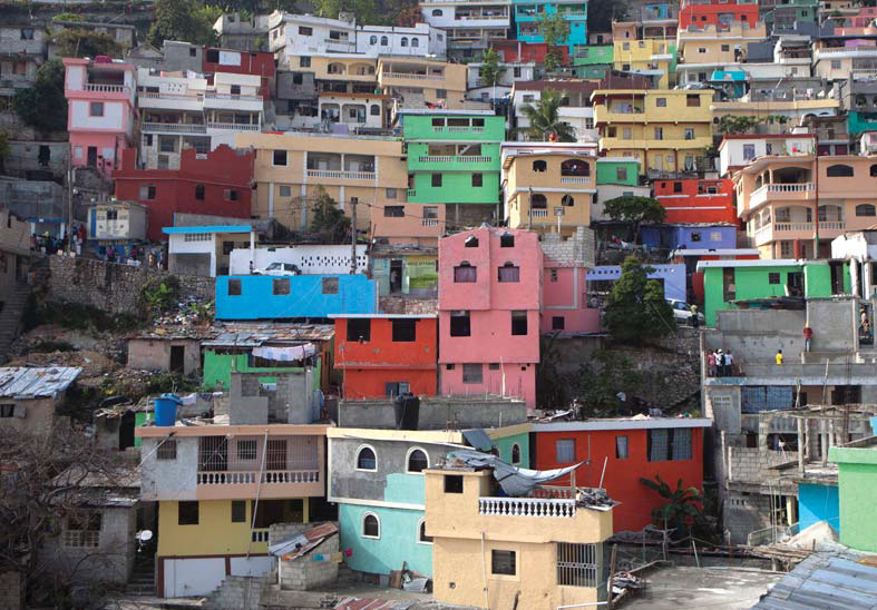 Three main focal points of the project include passive ventilation, the patient-family dynamic, and visibility and wayfinding. In our research we found that the healthcare experience in Haiti is often highly crowded and chaotic. Large crowds of people gather all day to wait to be seen by a doctor. This level of social desperation made an impression on our group. Our design eases this chaos by providing spaces that are well ventilated, that include room for family members, and that are easy to navigate. There are three main wings of the design. The front volume of space houses entry and exit sequences with housing lying above. The angled wing houses the path of the common care patient. Patient exam rooms fill the wing and its directionality points the patients in the direction of entry and exit. The patient rooms have double circulation that leads to a secondary greenspace. This greenspace houses outdoor extensions of the rooms so that the doctor and patient can go out into the direct sunlight to make a tough diagnosis but still maintain privacy to the space. The rooms remain private because clerestory windows face the main courtyard while larger CMU block windows face the private secondary space. The west wing houses space for patients who need additional care such as observation, isolation and surgery.
These wings are filled with volumes that are pulled apart and isolated from one another such that wind can pass through the site with ease. The spaces are arranged around a central courtyard to increase visibility so that patients have a much more thorough and obvious understanding of what goes on around the site and where they need to be (or not be) at all times. The east wing swings open to increase visibility to the site and to extend the view of the skyline. This way the space will not feel daunting and compressed. Instead it is open and inviting. In the center of the courtyard are four blocks of concrete seatwall with trees in the center to provide shade and activate the space for those who are waiting.
The patient-family dynamic is approached by providing instead of negating space for the family members to wait. It is a cultural norm for the families to all come together and to want to know what is going on with the doctor and the patient. Instead of pushing these people out, the design gives heed to social and cultural trends and provides comforting space for these individuals. This cuts down on chaotic behaviors from the patients and the family members and allows for a more comfortable experience.
