2011 haiti_utk publication

One to Another

A Downloadable Publication from the 2011 Haiti UTK Studio


WBIR Report of the Haiti Studio

Introduction haiti_utk

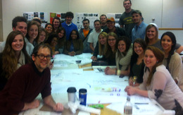
Welcome to the Haiti UTK site! The work on these pages reflects student engagement in design for both a school and housing for the community of Fonds des Bloncs, Haiti in collaboration with the Haiti Christian Development Fund. The project was initiated in the early fall of 2010 and subsequently a class of 19 students, in the spring of 2011, was given the responsibility of deisgning a secondary school. The school is under constuction. A new group of students is now hard at work developing new housing in Fonds des Blancs. The work of these students can be seen in the pages of this blog. Students of the class will be traveling to Haiti Februay 2-6 to collect addiional data. It is anticipated that this second phase of the project will be completed in late April with construction starting summer 2012. The work of the students is being guided by three primary faculty, John McRae, David Matthews, and Chris King, a local practictioner. The students during their exploration will engage a wide range of issues including context, culture, resources, climate and other outside factors not common to their expereince. 

Students: Cassidy Barnett, Aaron Brown, Sarah Heimermann, Mitzi Coker, Emily Corgan, Ben Cross, Peter Duke, Emily Fike, Sam Funari, Lauren Heile, Kendra McHaney, Lauren Metts, Morgan Oiler, Bernice Paez, Forrest Reynolds, Emily Ryan, James Sawyer, Zachary Smith, Robert Thew, Cory Wikerson Faculty: John McRae, Chris King, David Matthews

search haiti_utk
Special Thanks!

The Haiti Studio for spring 2012 is being supported by HaitiServe foundation based in Knoxville Tennessee, that is focused on outreach and engagement in improving conditions in Haiti. 

Entries in Clinic (9)

Saturday
Feb162013

U-haul-spital Mobile Clinic

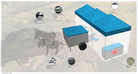
U-haul-spital in use with material call-outs. My design partner (Tiffiny Hall) and I created the U-haul-spital, an Emergency Medical Response Unit (EMRU) based off a small, off-road trailer that housed enough supplies to serve a community in need for an average of 5 days.  As a team, we concentrated on the technical aspects and functionality of the unit, to insure the unit would accomplish its task; this included material and construction research and supplies organization

Tiffiny and I learned that research is the key to creating a successful project.  Through our research, we found new materials, construction methods, and possibilities that helped us in designing the EMRU.  Durability and mobility were major concerns as this unit is to be reused and will need to travel over any terrain; therefore, an engineered plastic trailer is to be attached to the aluminum alloy frame.  The storage carts and tents are a modular system allowing for a maximum of adjustability.  The reviewers—made from a group of design and medical professionals—believed that this aspect of the design was agreeable to the needs of Haitian and foreign medical practitioners alike.
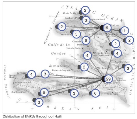
Distribution of EMRUs throughout HaitiDuring the critique the main issue was the logistics of dispersing, securing, and transporting the trailers.  As a team, we spent a lot of time researching Haiti’s need for medical care in relation to the population density.  As a pre-disaster unit, it is also meant to be used as a mobile clinic; additionally, the EMRU were to be housed at airports for ease of restocking supplies and initial transport.  However, this prompts the question: Who funds, owns, and operates the units?

As a next step to the design process, we would need to look even more at the cultural aspects of post earthquake Haiti to answer the issues that were discussed in the critique.  The logistics of ownership would need to be fully worked out to insure the success of the units in Haiti.  
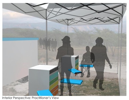
 Interior Perspective: Practitioner's View Final Presentation Board

Saturday
Feb162013

ROH medical clinic

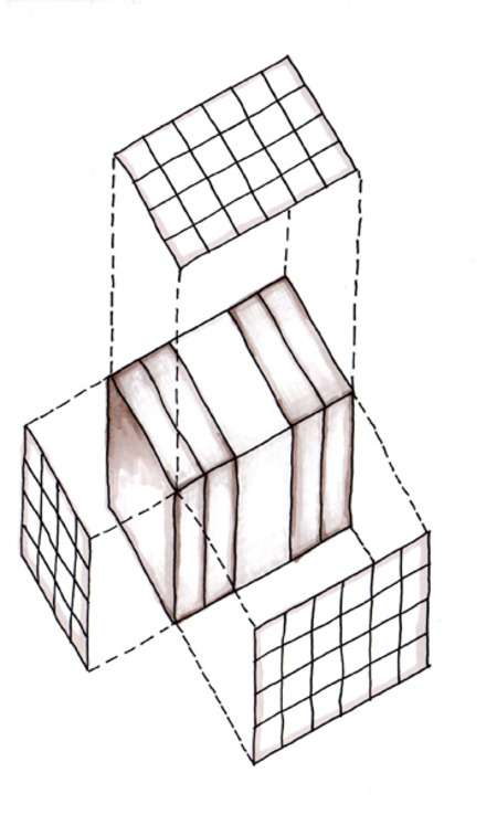
ROH in compact form

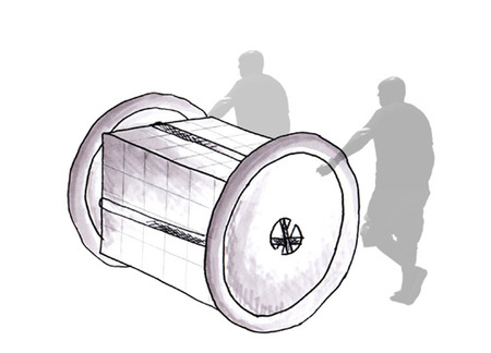
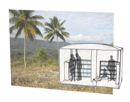
Designed as an emergency medical response unit, ROH, Rolling on Haiti, is a compact, mobile unit intended for delivery to a location in need. The compact unit encases two sets of fully stocked shelves, four water bladders, collapsible aluminum poles, and Tyvek canvas, all encased with square rubber floor tiles. The steps for set-up are feasible with three to five persons, beginning with the placement of the flooring and followed by the placement and opening of the hinged shelves. Creating a U-shape, the shelving units define two exam rooms with the Tyvek canvas enclosing the entire unit. Planning for numerous patients and intense outdoor temperatures, ROH includes four benches within the shelves, requiring simple set-up and offering convenient placement for patients being seen and those still waiting. With the completion of the stored medical supplies, it is hoped that a Haitian family will take ownership of the former medical shelter, reusing the elements in a domestic manner.

Relationship of floor tiles to compact unit

With the review of fellow nurses and doctors, minor changes are needed for greater efficiency and success as a mobile medical unit. Programmatically, the pharmacy requires independence from the exam rooms. The modularity of ROH provides great potential for spatial planning, however security finds great prevalence in the modules, needing sufficient space and enclosure. In addition, the Haitian heat and humidity, particularly in the peak of summer, creates slightly unbearable situations. Thus, ventilation design, such as windows with mosquito netting, needs implementation to maintain the miniscule breeze flow; sanitation also requires continuous airflow with the presence of TB patients.

ROH medical clinic in full use

Looking to future design improvements, greater attention is specifically needed in the spatial planning. Focusing on a compact scale, the limitations of materials and storage provide significant design challenges for ROH, however it is possible to reconfigure the exam rooms and the placement of the pharmacy to maximize the use by medical persons. Detailing of the compact unit, such as the size and weight of medical supplies, requires further attention as well, helping to clarify the mobility of the unit.

Saturday
Feb162013

detachApack 

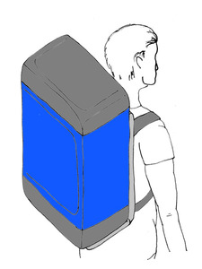
DetachApack is a mobile medical unit designed for quick and easy setup, along with minimal use of materials and supplies. The pack would include one day’s worth of supplies, medical and pharmaceutical, for 8 medical personal. Each pack also includes one fold out lounge; this would accommodate a patient and a doctor at each station. Supplies would be organized within the pack by dividers, as well as zip off sections to separate the medical from the pharmaceutical supplies. The mobile medical unit would serve approximately 250 Haitians over a four day period with a set of 8 backpacks per day.The detachApack being used by a medical personnel.

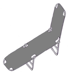
Though the pack functioned as was planned there were a couple lessons learned, as well as a few minor tweaks that would make the pack even more functional. The first major lessoned learned from the nurses, would be to make sure there is a good separation between the pharmacy and the doctor and nurses. This would help with crowd control and security of both the medical and pharmaceutical supplies.  The original intent of the detachApack was for the medical and pharmaceutical supplies to be separate from one another in setup, but more specific instructions would improve upon this idea.The fold out lounge chair that could be used for patient examinations.

A functional issue that could be designed better is the fold out lounge chair. Though the idea was beneficial and useful, the design was too low to the ground. This would cause for the doctor to be bent over most of the day. The design could be easily fixed to accommodate a system of telescoping legs for adjustable height as well as the possibility of uneven terrain at the site.

The ends of each pack can be zipped off to be distributed to separate areas of the clinic setup.

 A final critique of the project was the labeling system, or lack thereof. Other than making the zip off sections different colors there was no indication of what was included within the pack. To assist in the ease of setup, a clear indication on each bag of what was inside, such as a list of supplies or a number to indicate what day the bag was to be used for, would decrease a possible mix-ups of bags or the nurses not being able to find a certain medicine quickly. Each bag would also need to be slightly modified to accommodate a space to carry water, as well as an individual lunch for each medical personnel per day.

detachApack presentation pdf

Wednesday
Feb132013

Kabwet Clinic - Reflections

Project Presentation PDF

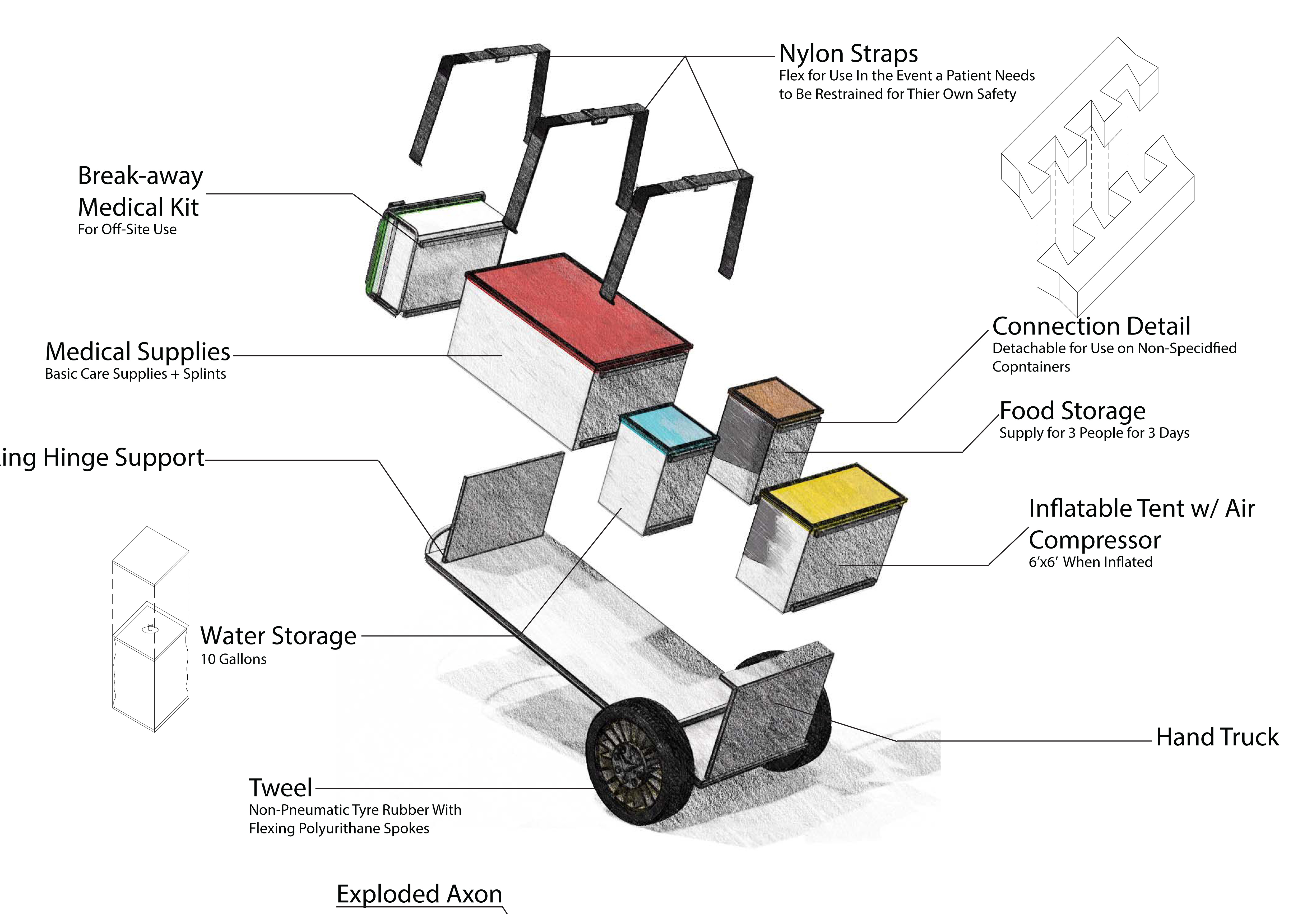
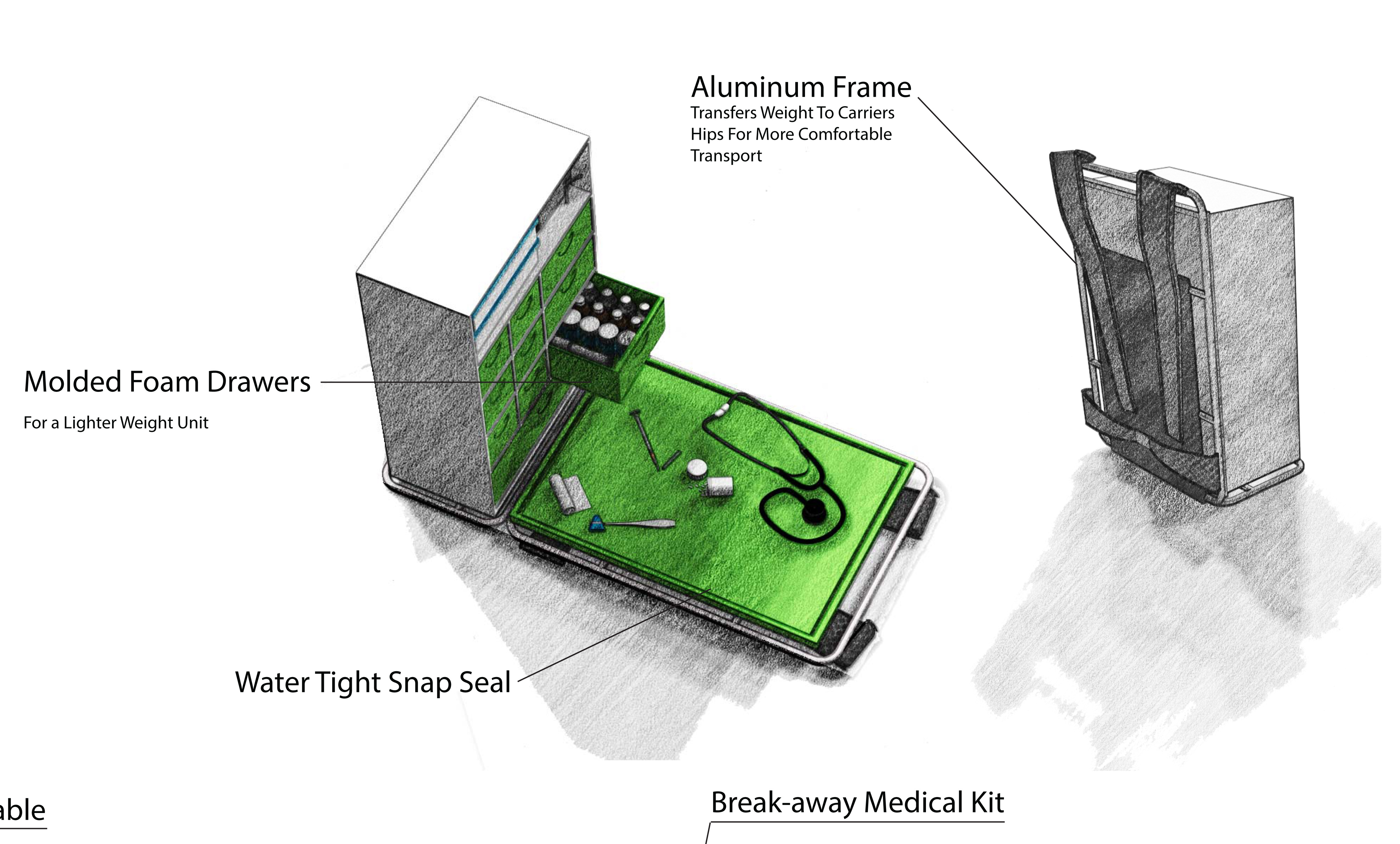
This project, the Kabwet Clinic, is the design of a mobile medical unit meant to be used in rural locations by Haitians for Haitians. The unit would be stored in the city hospitals and deployed to remote locations on a systematic, daily basis in order to help release the existing pressure of overwhelming medical need in those areas. The design for the Kabwet Clinic is easily sustainable in such an area due to its ability to travel through diverse terrains by a variety of vehicles, and existing of components that can be replaced by local materials. Its design maximizes its lifespan and functionality. The key to the success of the Kabwet Clinic is its implementation into the Hatian culture and continued use by its population.

Ultimately, I feel as though this project is a success to its purpose. I would have liked to have more time to show in more detail the overall lifecycle of the cart specifically since we designed it so that it could be used for purposes other than the clinic. We did this for every aspect of the project but it was not shown as strongly as I would have liked in the presentation.  I am very proud of the illustration that we did use, however. I believe they communicate what we meant the to communicate.

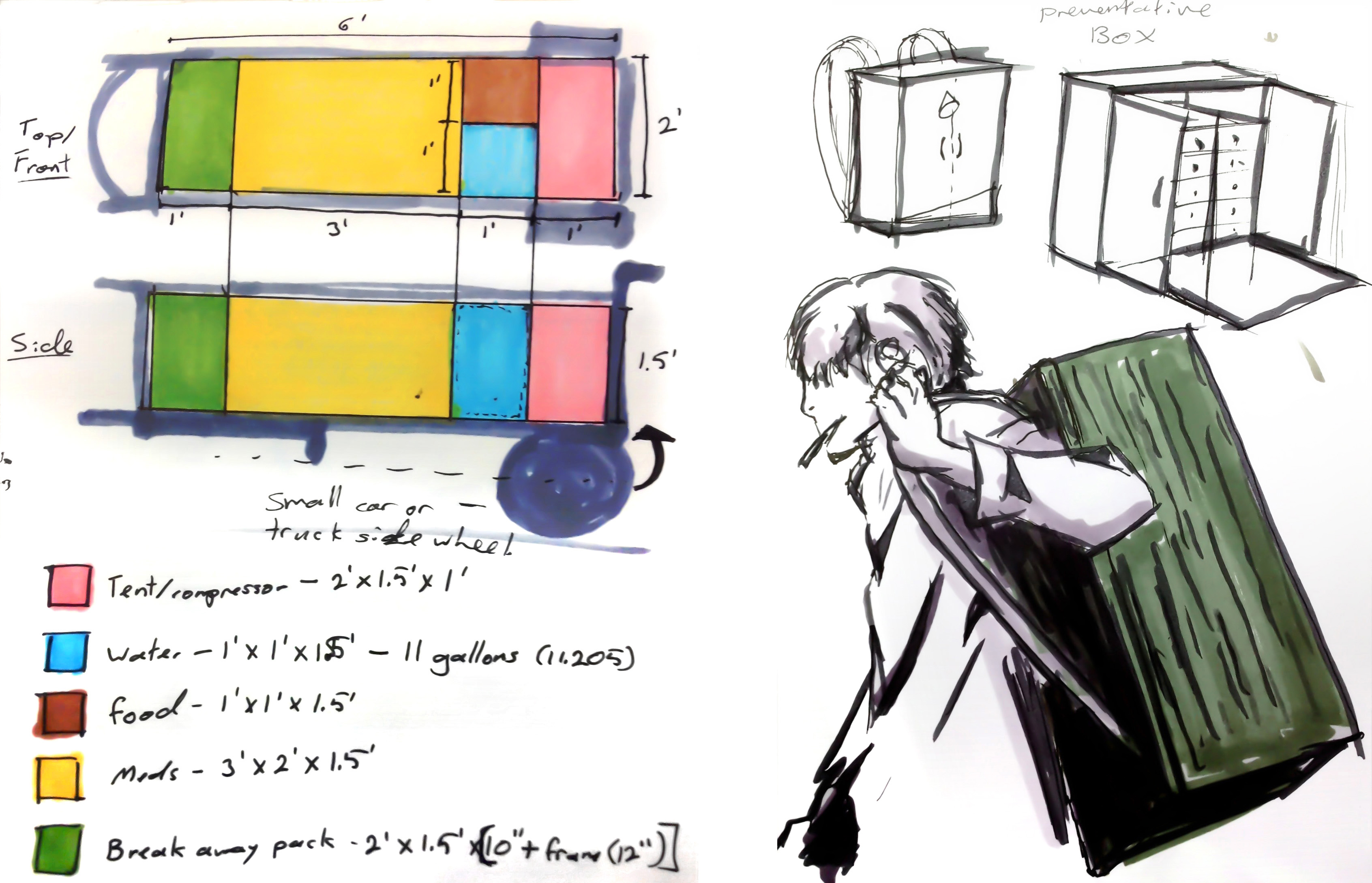
The cart was probably what changed the most throughout the process. Our first iteration of its design was much more complicated,  specifying an extra set of wheels, a hand crank and a far-too-unrealistic hinge system. That we were able to siplify the transformation to a single hinging panel is a testament to the power of collaboration.  One of the things that most affected the design process was the change in type of medical treatment it was to provide. Much of the equipment we thought would be necessary in our early iteration was dropped in favor of carrying more of the basic care essentials - a decision that proved to be most advantageous as it lead to the possibility of a modular, multipurpose storage system.


 If we had more time to work on this design I would hope to rework the modular system to consist, instead of snap-seal plastic water-tight containers, of hefty wove baskets with a ridged lid and frame so that they could still be used as seats and work surfaces but could be manufactured locally. In order to make them water-tight I could specify an inner plastic layer that would serve as a sort of water skin and surround the contents of the boxes.


Page 1 2