2011 haiti_utk publication

One to Another

A Downloadable Publication from the 2011 Haiti UTK Studio


WBIR Report of the Haiti Studio

Introduction haiti_utk

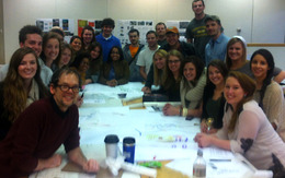
Welcome to the Haiti UTK site! The work on these pages reflects student engagement in design for both a school and housing for the community of Fonds des Bloncs, Haiti in collaboration with the Haiti Christian Development Fund. The project was initiated in the early fall of 2010 and subsequently a class of 19 students, in the spring of 2011, was given the responsibility of deisgning a secondary school. The school is under constuction. A new group of students is now hard at work developing new housing in Fonds des Blancs. The work of these students can be seen in the pages of this blog. Students of the class will be traveling to Haiti Februay 2-6 to collect addiional data. It is anticipated that this second phase of the project will be completed in late April with construction starting summer 2012. The work of the students is being guided by three primary faculty, John McRae, David Matthews, and Chris King, a local practictioner. The students during their exploration will engage a wide range of issues including context, culture, resources, climate and other outside factors not common to their expereince. 

Students: Cassidy Barnett, Aaron Brown, Sarah Heimermann, Mitzi Coker, Emily Corgan, Ben Cross, Peter Duke, Emily Fike, Sam Funari, Lauren Heile, Kendra McHaney, Lauren Metts, Morgan Oiler, Bernice Paez, Forrest Reynolds, Emily Ryan, James Sawyer, Zachary Smith, Robert Thew, Cory Wikerson Faculty: John McRae, Chris King, David Matthews

search haiti_utk
Special Thanks!

The Haiti Studio for spring 2012 is being supported by HaitiServe foundation based in Knoxville Tennessee, that is focused on outreach and engagement in improving conditions in Haiti. 

Entries in Haiti (19)

Monday
May062013

Eben-Ezer Medical Clinic Addition

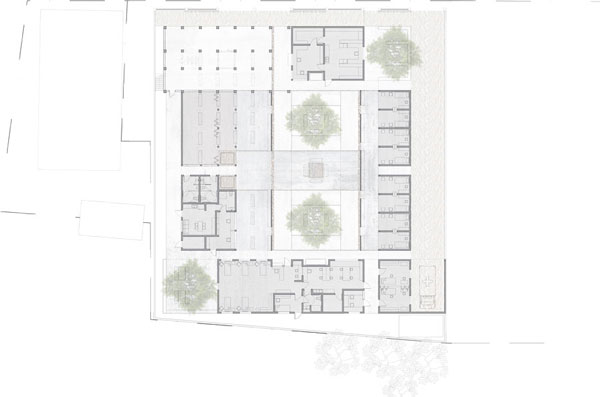
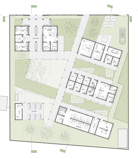
Site Plan

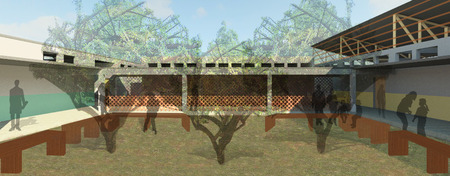
FROM THE OUTSIDE-IN:  to maximize cooling within the buildings, waiting spaces for patients and their families occur in outdoor courtyards and covered areas.  Further waiting for children, families, and patients alike may also occur below the mango trees planted throughout the campus.  By keeping patients and families on the outside, security and sanitation are maximized while heating is minimized.  With these factors in mind, the addition and existing must be designed from the outside-in so that the buildings contain multiple layers of privacy rather than a clear-cut line.      

THE ROTATED CENTER BUILDING:  rotated to align directly east-west for ventilation and solar benefits, the center building creates a more subtle turning angle into the site from check-in.  Additionally, by splitting the building into two parts, the center pinwheel point creates a resting space and area for recollecting families or thoughts before moving to the pharmacy or other parts of the campus.  This space may also be used for waiting and rest for the entirety of the site due to its central access.            

DOUBLE-HEIGHT ENTRANCE:  this entrance (section below) provides an indication of entrance (though patients line up infront of the existing building) and allows views into the complex.  This glimse into the campus gives patients a chance to understand or view what to expect from their visit.  This glimse is not intensive--visitors and patients waiting for check-in are not looking into exam rooms--but it would allow for a showing of activity, circulation, and waiting within the campus.

Concrete covered walkway (green), walkway in under building roof (blue)Patient paths

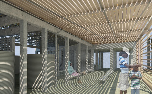
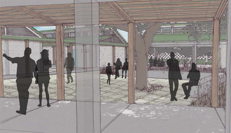
CONCRETE CONNECTIONS:  to cover the patient paths and general walkways, two different methods have been used.  Spaces in blue indicate wooden trusses and metal roof overhead that would extend from the building structure itself.  Spaces in green indicate a concrete connecting cover that would form from the side of the buildings and extend over walkways and seating.  This covering would be somewhat lower than the roof overhangs to allow provide shading.

OUTDOOR WAITING SPACES:  a variety of waiting spaces have been designed to discourage a feeling of mundane similarity.  Linear waiting is provided near the exam rooms and laboratory so that patients may be called in order and moved quickly through the space.  In the pharmacy and central pinwheel area, waiting is clustered into an area or zone with the understanding that these spaces tend to see a high volume of patients and families.  

Street elevation

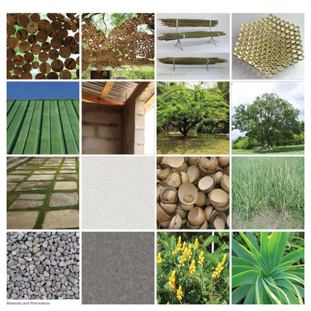
SIMPLE AND LOCAL:  As per the heuristics SIMPLICITY and LOCAL AVAILABILITY, the campus must be feasible within the scope of Haitian technology and construction methods.  After much research and precedent studies--all resembling those directly below--it became clear that concrete frame with block infill was the most popular and practical.  In this sense, this method of construction does not stretch the technological methods available in Haiti and can build off the strengths of their existing construction industry.  Overhead, wood site-fabricated trusses and metal roofing (Haitian-made of course) take further advantage of the construction methods existing in Haiti.  Additionally, all materials that comprise the building should be found locally with exception given to the wood elements, in which case, Ft. Liberte’s proximity to the Dominican Republic is very beneficial.    

Monday
May062013

Eben-Ezer Medical Clinic Expansion | Ft. Liberte, Haiti

Haiti is a very impoverished nation where organized, public healthcare is virtually non-existent. The majority of the population has never experienced a clinic-type setting before and often time suffers from disease and sickness caused by unclean water. More than anything, there is an overwhelming sense of chaos and disorder throughout the nation.

Ground Floor Plan with paving patterns

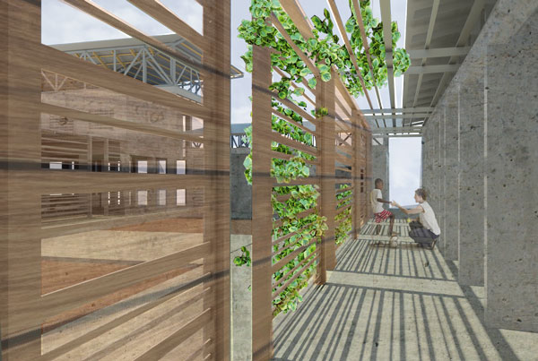
Because Haiti is still a developing country, it was a necessity for the design of this medical clinic to accept and implement passive strategies with natural daylighting and natural ventilation. Using a series of screens to not only act as shading devices from harsh direct sunlight, but also as a permeable ‘wall’ in the main served spaces to allow for ventilation, these passive goals were able to be achieved.  

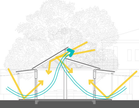
Diagram: Natural Ventilation and daylighting from green screen within exam rooms


View of circulation under green screen from back of site


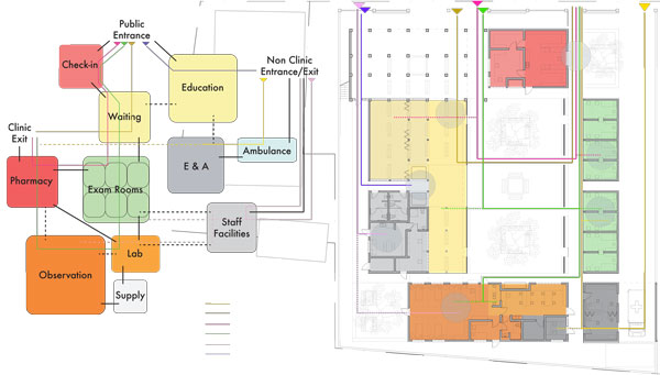
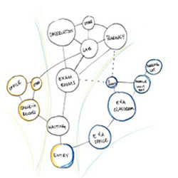
Positioning the check-in at the entrance, seen instantly through the newly renovated existing clinic (which I had turned into a lower level colonnade), allowed an immediate recognition of the sequence and order of programmatic pieces. From the check-in one would move directly into the waiting area. With a direct correlation to the exam rooms, divided only by an elongated courtyard and the screens, the patient can begin to understand and visualize the next space they will most likely inhabit. From there, one would either move towards the observation and lab area, or on to the exit of the complex, where the pharmacy is located for a smooth and easy transition back out onto the street of Ft. Liberte.


Programming Diagrams

The clinic has been designed to blanket outside chaos with a calming sense of organization and wayfinding, applying bright colors found all around Haiti into the different programmatic elements within, also creating a sense of comfort and familiarity. Mostly, this medical clinic has been designed to allow the patient to leave with something more than they came in with: new-fangled knowledge.


Section A : Cutting through waiting/exam rooms and adjacent screens

Section B : Cutting through pharmacy/laboratory rooms with green screen in background

Section C : Cutting through observation/laboratory/exam spaces

Because of the lack of clean water in most regions of Haiti, I chose to implement a simplistic system of water collection, allowing this visual process to take place in the check-in and waiting area, where most, if not all, patients would find themselves at some point or another. From here, they would move into an exam room. En route, patients would pass by the central focus of the exterior courtyard, a solar still, which would be constantly distilling and filtering water throughout the day for the use of the clinic, providing them with a better understand of the way in which anyone can produce clean water.

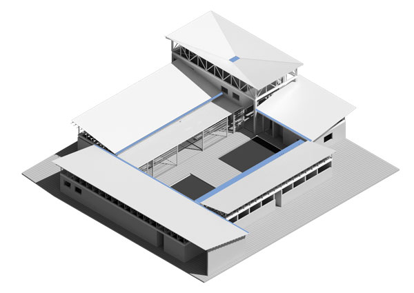
Massing Site Axon showing ideal water collection routes

View looking into waiting/education spaces from back of site

Monday
May062013

Clinic Community

FUNCTION

Clinic Community strives to provide a variety of services to the citizens of Fort Liberté. In addition to serving as an innovative local clinic, the complex also provides educational services as well as opportunities for community involvement.

The clinical component is composed of standard medical program such as triage, exam rooms, observation rooms, laboratory, and pharmacy. The clinic provides anywhere from basic medical services to eye and dental care. In the proposed third phase of the project, a medical suite is included in order to fully encompass the needs of the local population. The waiting area of this component takes place in a designed intermediate space for comfort and ventilation. It is also articulated with a strategic color system in order to provide way-finding.

PREPARING FOR RAIN

When it rains, it pores in Haiti. So its important to keep rain from blowing into the building. woven palm wscreens used as windows and doors allow air to flow while keeping the rain out.

FORM

The plan of the complex is organized in a way that allows for both easy way-finding as a visitor of the clinic and also provides a sense of community. It achieves these things through the use of a courtyard scheme. The primary programmatic components of the structure are organized around a central courtyard that provides not only a large community space, but also allows adequate ventilation throughout the complex.

The courtyard is divided by a series of stepped concrete walkways. The steps of these pathways allow for additional seating and the pathways are placed in a way that relates exam rooms to the observation room, laboratory, and pharmacy. The pharmacy is located upon exit of the complex and can also be easily accessed from the street.

MADE IN HAITI

Another underlying concept of the Clinic Community is the commission of local artisans and craftsmen to create a comforting and recognizable environment for its visitors. These commissions would take form in everything from furniture and millwork to seasonal murals and wind chimes.

SEATING

The seating is made from painted #5 rebar and sealed palm wood and would be made by local craftsmen. Since much of the seating is in a semi-enclosed area slats afford a surface that would allow rain to run off.

Final Boards

Monday
May062013

Eben-Ezer Medical Clinic

     After an in depth study of Haitian culture it was evident that our project would include several aspects of Haitian life.  Our concept integrated the Haitian culture with a focus on the patient’s needs.   After working through a conceptual design surrounding Haiti’s hibiscus flower, we turned our focus on combining this with the programmatic elements. This process led us to a schematic plan surrounding a centralized courtyard that’s functions serves as a waiting room that accommodates the larger Haitian families. Most Haitians visit a medical facility once if ever in their lifetime, and when they do they are typically scared and nervous. Then central courtyard removes the mystery of where family members are being taken to.

     Circulation plays a key role in designing a Haitian clinic.  There are many different patient paths that could easily become confusing to a first time visitor.  We spent a large portion of our design development focusing on how to incorporate patient circulation with program adjacencies.  We therefore created the most direct patient access to the specific needs of each individual patient. In the clinic the circulation translates into a "U" shape following the exterior of the courtyard.  The "U" shape creates one single path of circulation minimizing confusion and congestion.


      The program of the clinic includes a check-in area with plenty of storage for records.  It is located in the front of the clinic parallel to the fence opening.  Once passing through the check-in one would enter the waiting area which combines an interior and exterior experience that proceeds to the central courtyard.  The exam rooms are next on the circulation paths.  There are six exam rooms and two specialty exam rooms that are designed with clerestory windows and pitched roofs to allow for ventilation and natural light.  On the back of the site is the lab area: because of its limited patient access it is blocked from the public courtyard by a lattice system. Opposite the exam rooms is the observation facility which also has clerestory windows and a pitched roof system to allow for ventilation and natural light.  The final stop on the patient path is the pharmacy.  The pharmacy is located in the front of the site adjacent to check-in and records.  It is important for the pharmacy to be near the exit due to the large amount of congestion that will occur there and they fact that almost all of the patients will need to go there before leaving.

Thursday
May022013

Eben-Ezer Medical Clinic Expansion

View from Waiting Area to CourtyardNestled in the unique culture and landscape of Fort Liberte, Haiti, the Eben-Ezer Medical clinic helps fill the gap in healthcare that plagues the northeast corner of the country.  To increase their scope of services, the current clinic is in dire need of an expansion.

Our proposal reacts to both the culture and environment of Fort Liberte.  The existing building’s structural grid is to remain intact; however, it is being modified to hold the waiting and check-in areas.  To prevent confusion for the returning patients after the renovations, the new entrance is located near the current location.  Opening of the building allows for better cross ventilation through the existing building—which was previously an issue.  This creates an area sheltered from the harsh sun, but still connected to the natural landscape of the site.

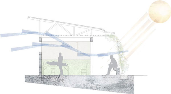
First Floor PlanTaking advantage of all the sustainable aspects of the environment, the new buildings are oriented to the natural wind and lighting patterns of the site.  This is even more apparent in the building section; clerestory windows allow more natural light to penetrate into the building, as well as, vents at the base of the walls promote stack ventilation to cool the occupants and let contaminated air to clear out faster. Typical Building Section

Because doctor visits are family affairs, ample space is allowed for the family to be included in the healthcare process and education by varying scales of indoor and sheltered outdoor spaces, while being surrounded by plants used for both eating and medicinal purposes, and orienting gathering spaces around the class pavilion.  

Materials Palette