2011 haiti_utk publication

One to Another

A Downloadable Publication from the 2011 Haiti UTK Studio


WBIR Report of the Haiti Studio

Introduction haiti_utk

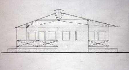
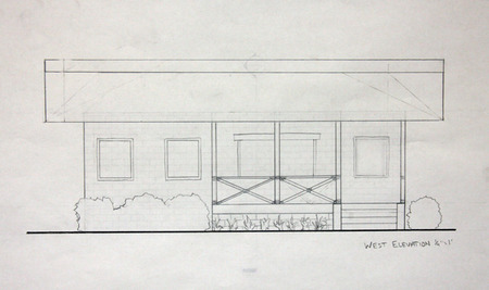
Welcome to the Haiti UTK site! The work on these pages reflects student engagement in design for both a school and housing for the community of Fonds des Bloncs, Haiti in collaboration with the Haiti Christian Development Fund. The project was initiated in the early fall of 2010 and subsequently a class of 19 students, in the spring of 2011, was given the responsibility of deisgning a secondary school. The school is under constuction. A new group of students is now hard at work developing new housing in Fonds des Blancs. The work of these students can be seen in the pages of this blog. Students of the class will be traveling to Haiti Februay 2-6 to collect addiional data. It is anticipated that this second phase of the project will be completed in late April with construction starting summer 2012. The work of the students is being guided by three primary faculty, John McRae, David Matthews, and Chris King, a local practictioner. The students during their exploration will engage a wide range of issues including context, culture, resources, climate and other outside factors not common to their expereince. 

Students: Cassidy Barnett, Aaron Brown, Sarah Heimermann, Mitzi Coker, Emily Corgan, Ben Cross, Peter Duke, Emily Fike, Sam Funari, Lauren Heile, Kendra McHaney, Lauren Metts, Morgan Oiler, Bernice Paez, Forrest Reynolds, Emily Ryan, James Sawyer, Zachary Smith, Robert Thew, Cory Wikerson Faculty: John McRae, Chris King, David Matthews

search haiti_utk
Special Thanks!

The Haiti Studio for spring 2012 is being supported by HaitiServe foundation based in Knoxville Tennessee, that is focused on outreach and engagement in improving conditions in Haiti. 

haiti_utk public blog index

Entries in UTK (4)

Tuesday
May082012

Reflecting on the Haiti experience

Looking back over the semester-long project, we realize what a great experience it has been! We knew from the beginning that we would be stepping outside of our normal realm of thought into another culture, another land, and another world. 

Our visit to Haiti was invaluable. It played a key element in understanding the culture and life of Haitian people. Surveying the site, visiting market, and interacting with community members gave us a more clear understanding of who we were designing for. Our greatest challenge was proposing schematic design to Joy and Jean Thomas before having been to Haiti to see the site first hand. None-the-less, we worked hard to create a holistic design and presented it to them in Haiti. Having them as a constant contact for the project was extremely helpful in our design process.
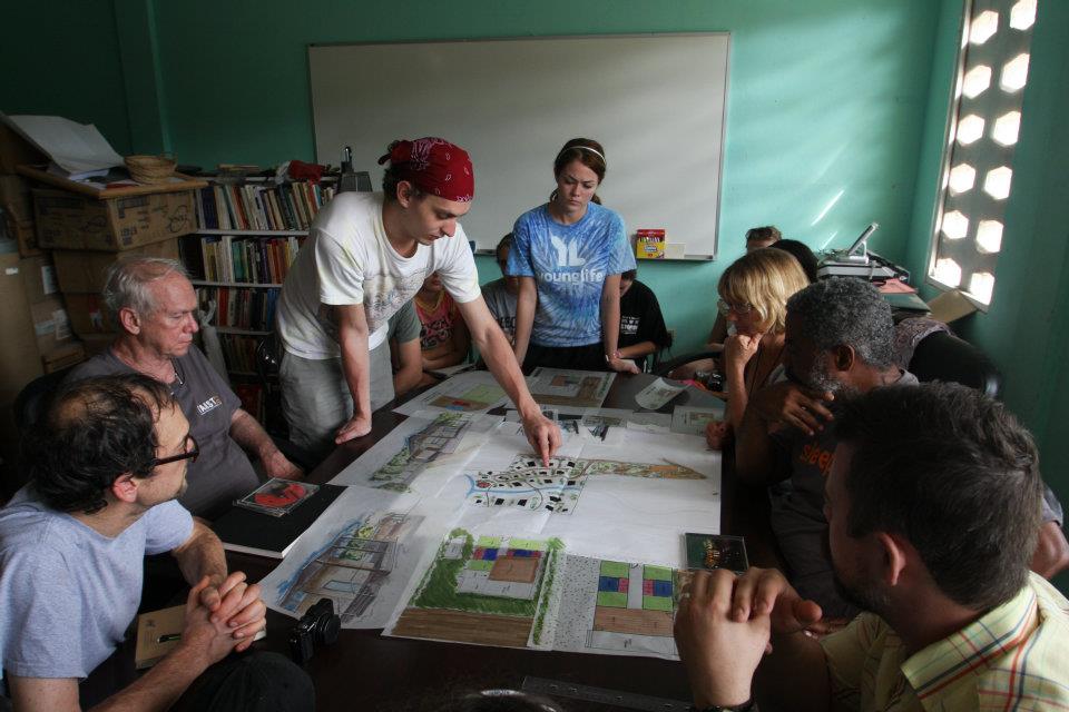
We felt humbled after our visit to Fond-des-Blancs and were even more eager to begin designing for the Haitian people. We wanted to connect with their thoughts, their fears, and use that to drive our design.  

One of the best parts about this project was the diversity in scale. We started off designing the entire site, including public gathering spaces, roadways, walk ways, etc. Once a site plan was finally worked out, we began designing individual houses. This led us to the smallest of details, including millwork drawings and material finishes. This range of scales allowed us to think on multiple levels of design. We had previously not thought holistically about site design.
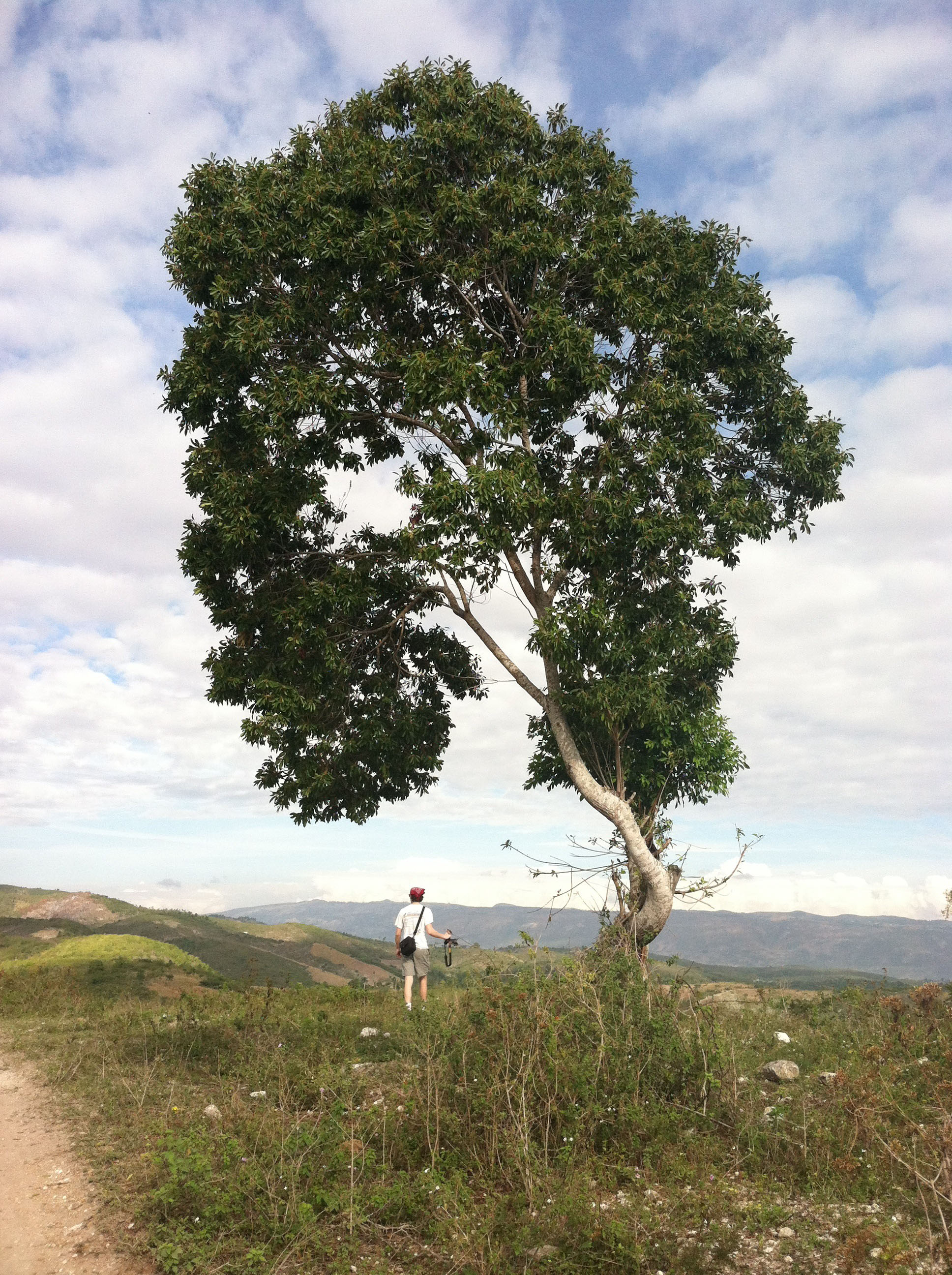
Overall, the "Urban Alternative" Haiti experience was priceless to our education. It challenged us to immerse ourselves in a very unfamiliar culture and design for what they would see as attractive and valuable. As much of a challenge as it was, it was also a blessing. While we still have many years to continue learning design, this experience has aided in our education and overall wellbeing to become better designers and better people.

Saturday
May052012

Open & Versatile: Young Professional Patriate House


Click here for PDF's of Drawings


Specifications

  • 2 bedroom (optional addition)

  • 2 full bath

  • 1,128 sq. ft.


Programmatic Goals

  • seperate the master bedroom and the guest bedroom

  • design an easily modifiable floor plan for future expansion of a third bedroom

  • connect the entrance and the back of the house

  • create simplicity and efficiency


Design Intentions

  • passive ventilation is a primary concern

  • take advantage of simple technology and energy efficiency

  • meet the needs and expectations of the occupant

  • design spaces and furniture that are interactive and dynamic

  • provide security


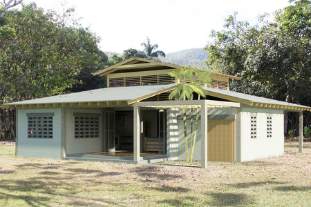
The second proposal for Team LLBen (Lauren Heile, Lauren Metts, & Ben Cross) is the Young Professional Patriate House. The home is designed to meet the needs of the occupant, implement passive and energy efficient design methods, and to create a comfortable dwelling.


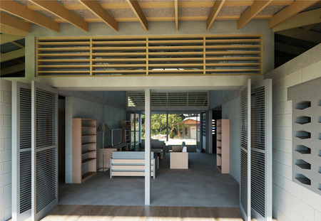
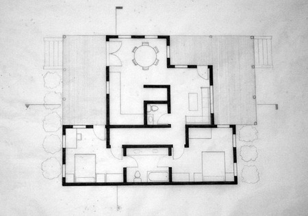
The layout of the floor plan connects the front of the house to the back of the house. With two tri-fold doors on both the front and back, the living room is capable of being opened completely to create one large “exterior covered space” while still keeping privacy to the bedrooms. We want guests to be able to enjoy the mountainous views on the back side of the house without having to navigate through private spaces.


The importance of privacy is taken well into consideration. One of our most important and more challenging goals was to separate the master bedroom from the guest bedroom(s). The challenge in separating the bedrooms is that we were forced to create two full baths and it was difficult not to waste precious space just for a hallway. The bedrooms are located on either side of the living room. These spaces are separated by a sliding door for extra privacy.


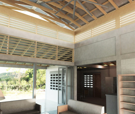
One other key intention for the design of this home was to make the living conditions inside the home as comfortable as possible. We learned on our trip to Haiti that the Haitian people like the interior of the home to be cool in temperature and dark. Considering the normal day of a Haitian, there is always plenty of sun and they are always outside. The home is an escape from the heat and the light. As far as light as considered, the fenestration has plenty of cover from the overhang of the eaves to prevent direct sunlight from entering. The clerestory from the monitor roof allows enough indirect light to keep the living room a space where tasks can be accomplished. The bedrooms will be darker, making them a place of rest and relaxation.


The monitor roof not only provides indirect lighting for the living room, but it is also the key to our passive ventilation system. Cool air from floor will rise, but it will eventually be heated by the solar heat gain from the metal roof. If the air were to be trapped, the house would heat up like a car with closed windows on a sunny day. With this design, the fenestration on the perimeter of the house, as well as the openings on either end of the living room, allows the cool breeze from outside to flush out the warm air inside (from SHG) through the clerestory of the monitor roof. This system works very well in tropical climates. In order to get optimum performance, we supplemented this system with a 10' diameter fan from Big Ass Fans®. They're energy efficient fans and they make a big difference in the performance of the system.


Friday
Mar022012

Housing Design for Ex-Pat/Retiree


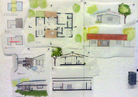
We were given the assignment to begin schematic design for one client type for our project in Fond-des-Blanc, Haiti. Our team chose to design a house for an Ex-patriate  couple moving to this rural area to retire.


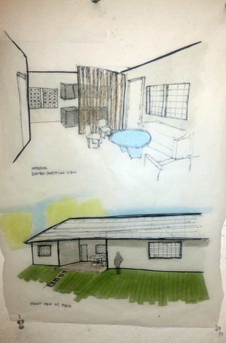
In our design for the Ex-patriates we focused on creating a house that is peaceful, connecting the resident with nature. We emphasized this serene experience in the relationship of the porch to living area and the main entry sequence. Our group attempted to interlock the porch zone to the living area through openness, making the porch and living into a more continuous space.  The front porch is the large, to be used as a social gathering porch, facing the pedestrian promenade. The back porch is to be used more privately, reserved for family and close friends. We kept the public areas of the house very open to make the space feel larger for the user. We divided the kitchen and living with a small partition of bamboo to create a visual barrier without the solidity and harshness of a wall. We are still considering how we can apply this idea to other interior walls of the house. 

After our critique, we realized many of the improvements that need to be made in our housing design. One issue was how we had placed closets and bathrooms on the exterior wall of the house, rather than moving them to the interior for better cross ventilation. Another suggestion was to make one porch more prominent instead of having two. We also realized the need for another full bath for guests visiting overnight. Overall, several spaces in the plan need to be shifted and our concept needs to be brought through the whole house in a cohesive way. 


Young Professionals (Patriots)

The emphasis of this design is to create darker interior spaces and promote natural ventilation.  We saw this house being located on the southern end of the site on the riverside near the commercial zone.  A solid wall is located on the south elevation to prevent direct sunlight from penetrating the interior and to reduce the amount of noise from the commercial area.  The other facades are more open, allowing the user the option to ventilate or light the home.  The porches are located on the northeast and northwest corners of the home in order to promote the views and relations to neighbors to the north.

The kitchen is located on the west side of the home (the back) giving access to an outdoor cooking area if needed.  The house also has a "jack & jill" for the residents, and a half bath for guests.  Also, the house has a "fly roof" in order to flush out the hot air that accumulates under the roof from solar heat gain.  However, the design needs to be reworked.  The living room is too small and the hallways take up too much area in the home.  The bathrooms need to be adjacent in order to have a unified wet wall.  Most importantly, the design needs a more solid concept.

Friday
Feb102012

LLBen's Reflection of Design & Looking Forward


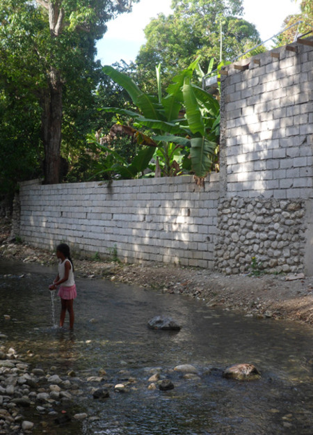
Crossing the Stream in Fonds des Blancs - Photo: Lauren Metts


m Photo Lauren Metts

After our trip to Haiti, we decided that our initial design needed several alterations to become more successful. Not knowing how much the extreme topography affected the site as a whole, we had designed homes that would no longer be legitimate to build. Also, we needed to take into consideration the noise coming from the generator the people of this community would have access to and how to deafen it. Being a new and improved neighborhood, the design of the kitchen within the homes needed to be altered to uplift and strengthen the notion of a more technologically advanced society.

Several key issues that we saw the need to develop further after our visit are as follows:

  1. The placement of homes within the site and the probable conditions needed to be thoroughly thought through after visiting the site.
  2. The homes needed to have access to a road or path of some kind for (at least) the construction purposes, as well as vehicular access.
  3. The relationship of public verses private spaces needed to be designed systematically to encourage outsiders to want to come to Fonds des Blancs, which included the size of the lot for each unit.
  4. The porch and its placement within the floor plan was a key component in the home. We also learned that the porch should be treated as the most popular room within the dwelling, being the main space inhabited by the owner and his visitors. The idea of a back, more private porch needed to be considered in addition to the front, public porch attached to each unit.
  5. Access and placement of the public spaces, water, a generator, the commercial program, and footbridge needed to be dealt with by thinking as a Haitian would (who would or would not have vehicular access).
  6. The diverse categories of housing for different types of people coming into Fonds des Blancs also needed to be considered as we moved from the site plan to the individual units.

With all of our designs, we had to keep the idea of the next phase of design in mind, Phase III, which included the airstrip adjacent to our site at hand, and would be a possible place to expand our initial design.

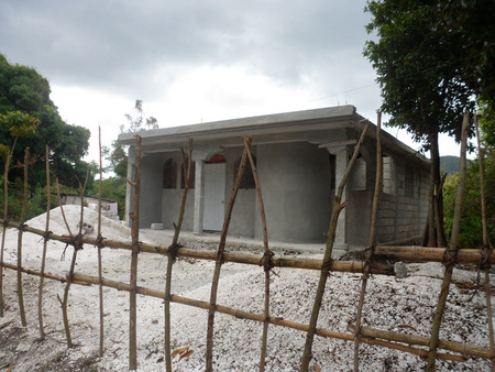
 Photo: Lauren Metts

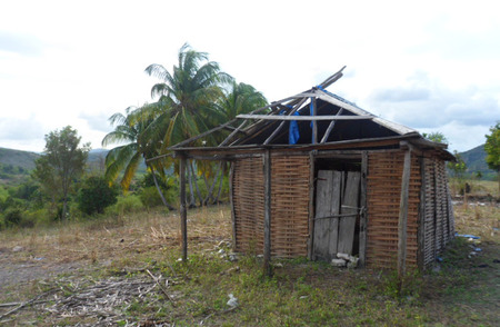
One of the homes found on our hike